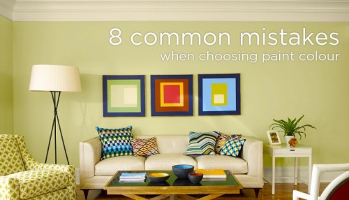
Can you imagine how many mistakes I’ve done and seen others do over the years as an interior designer? Well you can learn from them. I have seen it all!
Here are my top tips learned by experience based on what is the wrong thing to do and then a suggestion on how to correct it.
1) Choosing a paint colour in the store without checking it in the space
Solution: Use a fan deck in the light where it’s going to be used. Lighting in South Vancouver is distinctly different from Northwest Portland.
2) Using a darker or lighter shade of the largest item in the room
Solution: This is a colour scheme that has no colour “wow”. You can find successful colour schemes in magazines, and in nature, use the colour wheel. Chose the colour that best shows your personality and furnishings using the colour that best enhanses the colour in the room .
3) Not trying the colour first
Solution: Choosing the wrong colour can ruin the job, if you are not certain, do a test on the wall; it could appear nice on the card but have too much pink or yellow in it. Put it on the wall and wait 24 hours if you can. Look at in the different lights of the day and night.
4) Choosing cheap paint or a “cheap” colour
Solution: Good manufacturers keep their colours current and offer new shades to go with new furnishings. They use quality colourants and have sophisticated formulations. They use the best components to make the paint, and that quality it will show up in the final results.
5) Painting before all the items for the room have been chosen
Solution: Always chose the paint last AFTER you make a good layout, good focal point and a good message. Then chose flooring, lighting, and furnishings. Chose paint last. That’s how you get a custom coordinated look.
6) Being intimidated by all the choices and procrastinating
Solution: If you are having trouble picking just one colour – find 5 possible – RELATED – colours shades. Lay them out and chose the one that you like the best. That will at least get you started. Then test the colour on the wall.
7) Not visualizing the colour in the room
Solution: Bend the colour card so you are only looking at one sample at a time. Hold it up vertically in the room. If picking a ceiling colour hold it horizontally above your head. Imagine that colour on all the walls.
8) Not using colour to convey a message
Solution: Colour can speak – first work out what you want it to say. Choose the shades that best say that message. Even light neutrals have a message so chose carefully.
I hope this helps. I am going to write my next blog on white -my two top white choices and what is the perfect white for the west coast. Its funny when you get 100 designers in a room -how much they can talk about white!
Thanks for reading – leave your comments below.


Leave A Comment